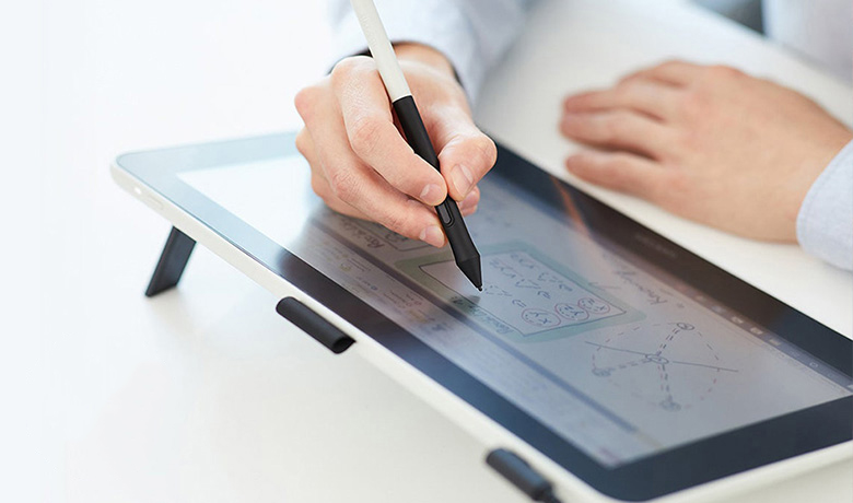
A new design strategy to bring the best pen experience also to non-professionals and creative beginners at reasonable pricing needed a different design approach, saying goodbye to some old convictions.
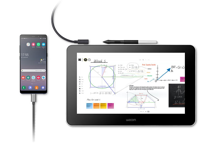
Meeting the needs of our target group, young creative people, we adjusted the use cases significantly, away from a computer bound device towards a high mobile and flexible use with
smart devices leading to an innovative connectivity to Android too (beside MacOS and Windows).
To clearly differentiate the new line-up my team and I created a new fresh design approach. Less straight and serious as for the professional pen display line-up but with a soft and inviting design language to show soul and simplicity as the core character.

Red Dot Award 2020, iF award 2020
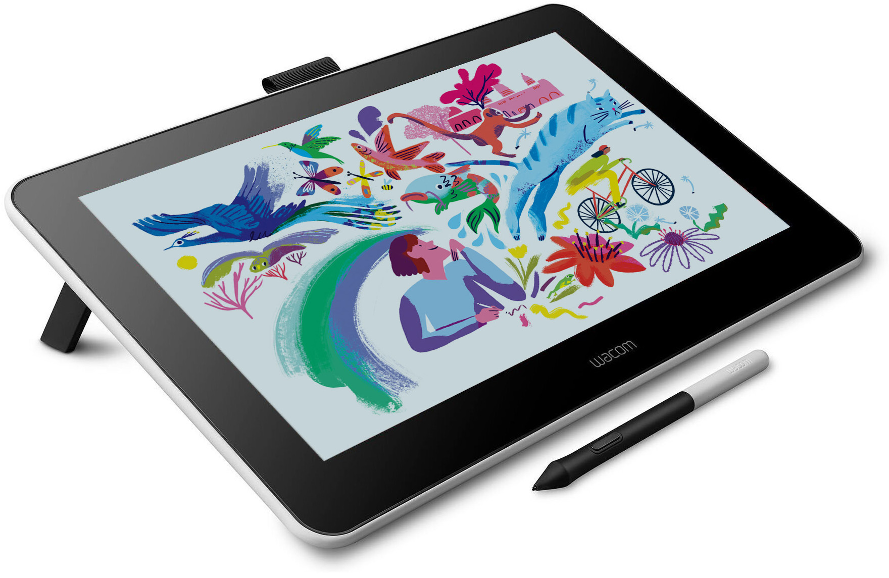
new design language
soul and simplicity
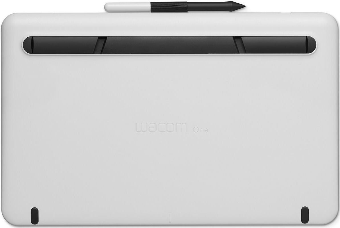
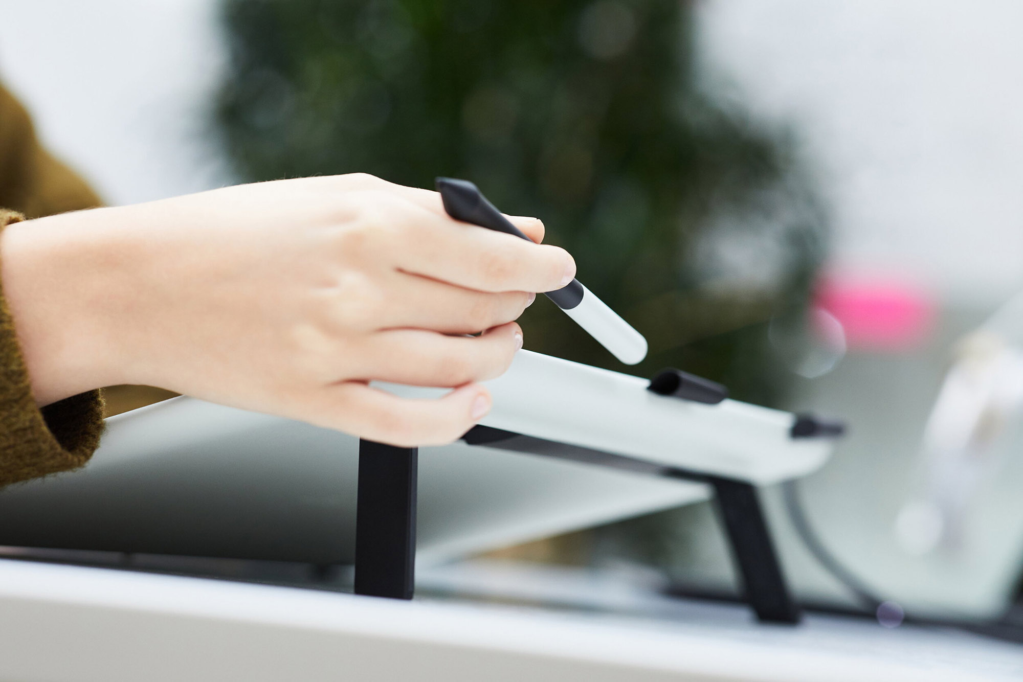
In order to convey this more friendly casual tone we decided that this could not be just another black tablet. We developed an original resin colour material and finish. The high contact surfaces such as the pen grip and legs and front face would be black to keep a practical and clean appearance. To keep on budget no expensive materials and finishes could be used and to all surfaces various subtle textures have been applied in a sophisticated way to still highlight the outstanding quality and performance even for a low cost, honest and true designed entry level product.
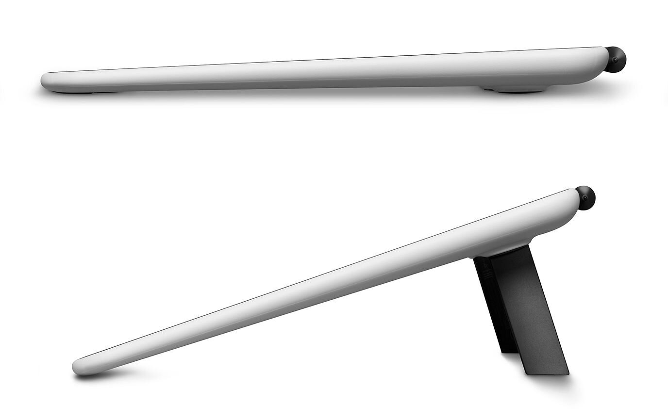
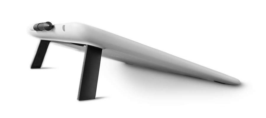
foldable legs
The non slip foot bar on the rear side can also be opened up to provide a more comfortable working angle.
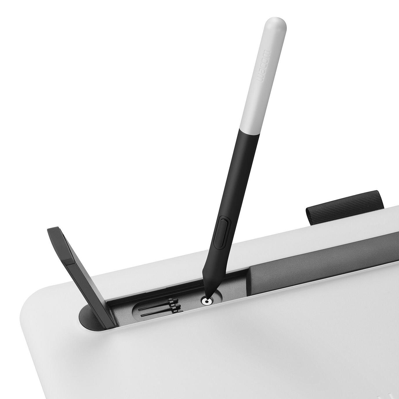
A nib remover tool and spare nibs are also discretely hidden under the fold out legs.
colour directions
The new design language aimed for young creatives included a strong focus on multiple fresh and modern colours to underline the inviting appearance with its soft and gently rounded forms. To test various colour directions with stakeholders within the company as well as with users several high fidelity prototypes were made to simulate the appearance. These were also used to refine design details as well as finally identify some possible colour directions.
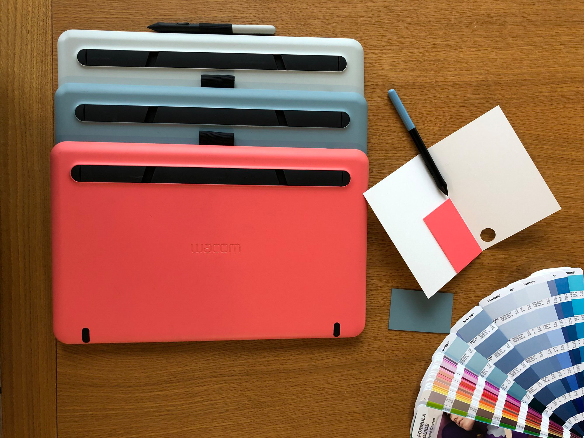
from concept to production
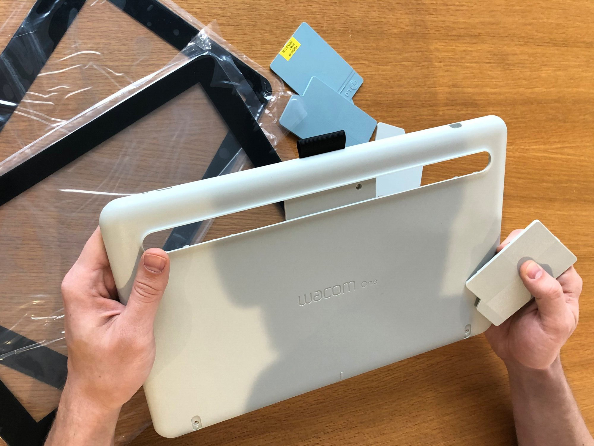
During implementation to mass production several loops needed to be made evaluating the final appearance of all parts. These checkpoints are frequently done onsite in the factories of the ODMs in China and Taiwan at every stage of the development process. Checking samples of parts but also of complete assemblies and the approval of limit samples to define acceptable tolerances within the production of each part. Beside colours and the various surface textures all aspects of the visual appearance and functionallity needed to be checked to maintain the design concept towards production start to finally provide the best possible user experience.
Image credits: Wacom, Giles Mitchell, Volker Huebner

